Discord: Accessibility in Web Apps Done Right
While Electron-based apps are often criticized for their performance or just for not being “native” enough for the system they run on, there are a couple of apps that are quite successful and immensely popular.
Some Electron app highlights that I am using daily, like Slack, Spotify, Visual Studio Code, and Discord — despite being quite complex applications — have decent accessibility. At least compared to a lot of the web (or even app) world.
Since I am using Discord quite extensively, I gave it a go and did my usual accessibility quick check. Spoiler alert: Apart from one big issue, it’s looking excellent.
The following is a quick check based on the Discord desktop app on macOS.
Settings to the People
Discord itself comes with a ton of different settings, as it is quite a complex application. It also has a separate settings menu for accessibility, although some more accessibility-related settings can also be found in the Appearance menu. The more settings, the better for different users with different needs. The same goes for video games, by the way, as I wrote in Options to the People.
Font Size
One of the main purposes of the app is to read and write chat messages. So it should not be a surprise that there is a setting for scaling the font size for chat text. The font size options range from your typical default of 16px up to 24px chat font size. You can even scale the font smaller if you prefer to do so.
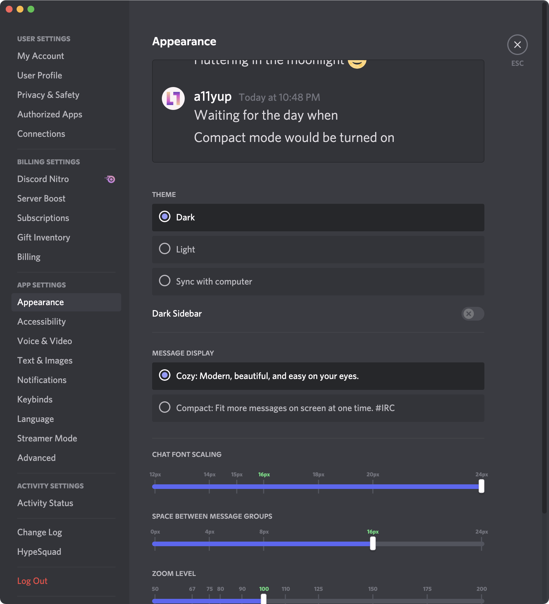
In order to make chat even more readable, there is another slider for scaling the space between message groups.
The font size setting is for text chat only. The rest of the UI can be altered with the next setting.
Zoom
On top of the chat font size scaling, there is a separate slider for scaling the whole Discord UI. This is akin to browser zoom, if not technically the same thing. You can scale up to 200% without running into problems.
As long as you keep the window sufficiently big, everything is still readable and nothing is cut off. You can create some messier scenarios where the layout breaks by going full 200% zoom and resizing the app to a narrower window size. Most of the things still stay usable, but they get very (!) crammed together.

Theme Options
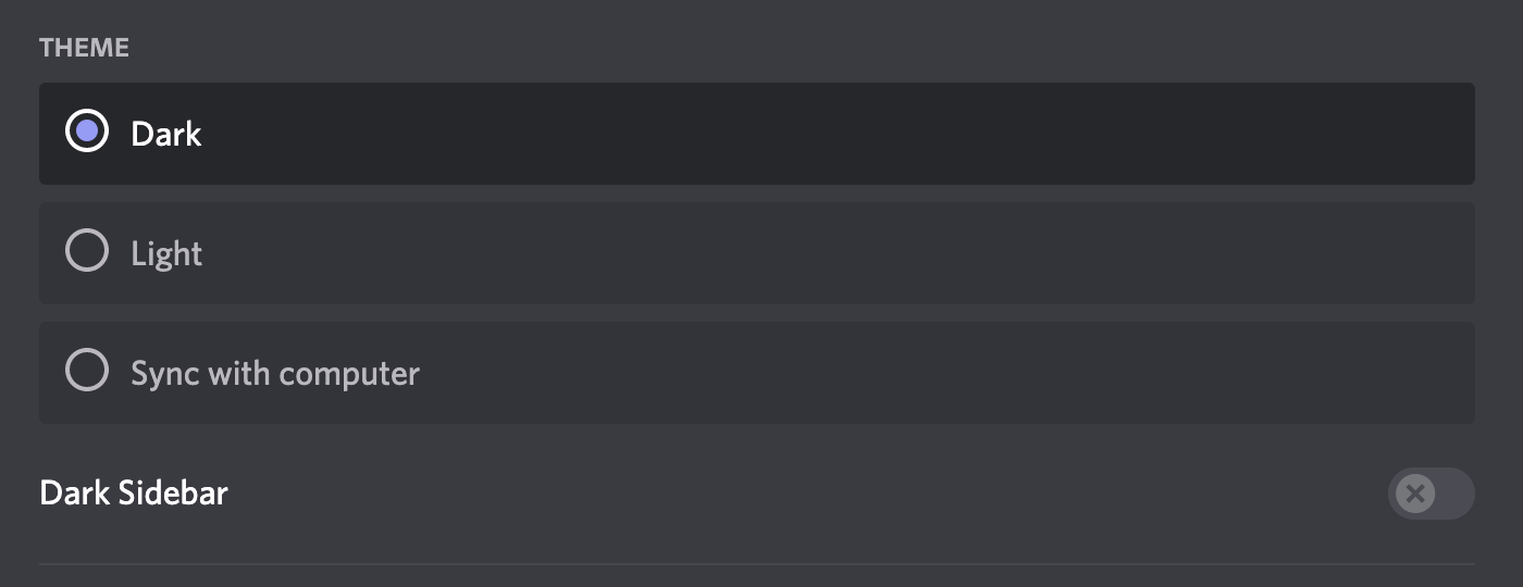
As is quite usual these days, Discord comes with two main themes. One light and one dark.
What’s good to see is that the app also provides an option to sync the theme with your system settings for theming. This tri-state of theming options (light/dark/system) is often lacking in most websites, which generally only provide a toggle button for a binary state (light and dark). That means there is either no integration of the system setting at all or no option to revert to the system setting after picking a preference via a toggle button. Yes, as of this writing, a11yup.com has that same problem.
The text and UI contrasts in both themes are very similar, and we will look at them in more detail in a later section.
Reduced Motion
You can enable Reduced Motion in the accessibility settings menu. This keeps Discord’s UI animations to a minimum. For example, shift or slide animations are replaced with pure fade animations (similar to how iOS handles this). You can either set the dedicated Enable Reduced Motion to on or make Discord sync itself with your system setting for reduced motion.
If you have been on pretty busy Discord servers before, you know that the amount of messaging happening can get quite overwhelming. Especially with the endless amount of animated GIF and emoji content.
Fortunately, there is an option to disable autoplaying both GIFs and animated emoji. If disabled, they only play when you hover with the mouse or put keyboard focus on them.

Contrast
The UI texts in both dark and light modes often have more than sufficient text contrast. Even in cases where there’s gray on gray text (like it is typically the case in dark mode), the minimum contrast of 4.5:1 is always reached.
The range of color contrasts is quite high, ranging from an absolute minimum of 4.5:1 in some parts of dark mode to a maximum of 20.25:1 in some parts of light mode.

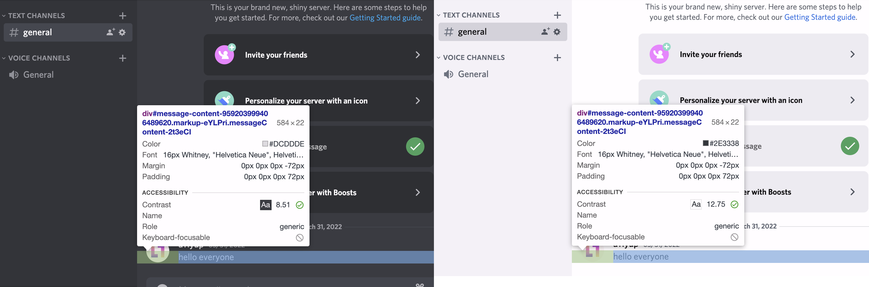
The button texts on Discord’s primary buttons are also looking good when it comes to contrast. The so-called Discord blurple (blueish purple) as a button color with a white text on top has a sufficient contrast of 4.6:1.
Incidentally, the blurple brand color was only recently darkened and was a bit lighter before. Prior to that change, the contrast did not meet the minimum contrast ratio. I tweeted about this a while back:
I love how the new @discord logo colors (incidentally?) also improve color contrast for #accessibility. The darker “blurple” color, as they call it, contrast a whole step better with white than before. pic.twitter.com/7VATA5ymmi — A11y Up (@a11yup) May 17, 2021
Communication Accessibility
What good is a communication app when the communication isn’t accessible. Modern online games these days often support text-to-speech (TTS) for converting chat messages into spoken word and, reversely, voice-to-text to convert spoken word into a live text transcription.
For TTS purposes, Discord provides two different features. Chat messages can be read out on demand by opening a message’s context menu (three-dot menu) and clicking Speak Message.
Additionally, if a text channel’s permissions allow for it, a user can also directly make Discord announce a written message via TTS to all users currently actively viewing the channel.
Unfortunately, to my knowledge there is no voice-to-text feature in Discord. There seem to be some third-party bot solutions that use live transcription algorithms that listen to a voice channel and write out the transcription to a text channel. A native solution is not on the horizon yet. This is quite a biggie. At least in the US, where the Communications and Video Accessibility Act (CVAA) requires that communication services be accessible, as stated in the very first point in the act’s text:
Requires advanced communications services and products to be accessible by people with disabilities. Advanced communications services are defined as (1) interconnected voice over Internet protocol (VoIP) service; (2) non-interconnected VoIP service; (3) electronic messaging service; and (4) interoperable video conferencing service. This includes, for example, text messaging, e-mail, instant messaging, and video communications.
There might be rules that exempt products from following this rule if they were released before the act was active. But this is where my legal knowledge ends.
Keyboard Accessibility
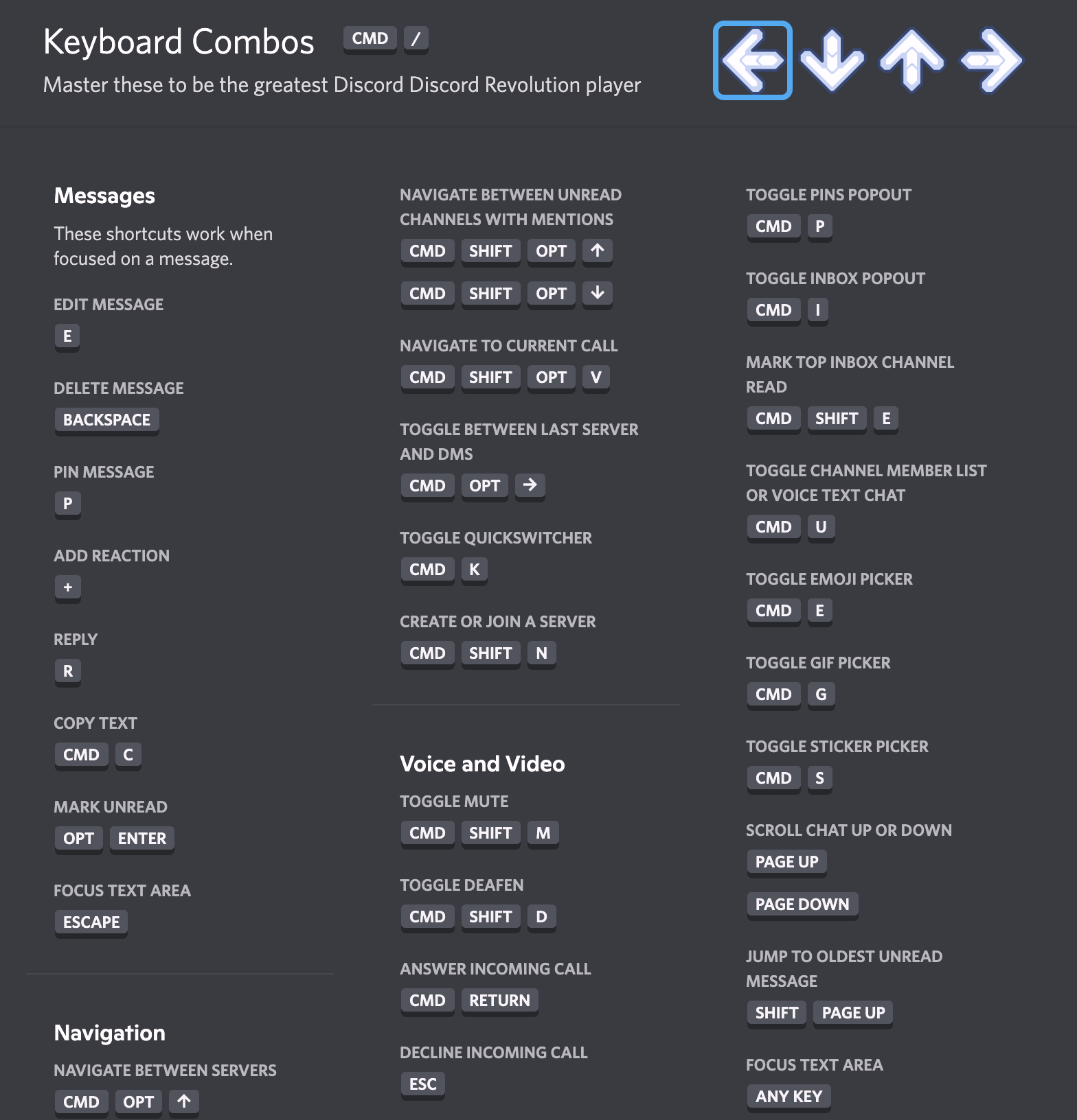
Keyboard accessibility is where Discord really shines. Like really! Not only is keyboard navigation working very well throughout the app, and the keyboard focus indicator is a very clear blue and thick ring, but there are keyboard shortcuts for often-needed functions. While doing research for this article, I learned a few shortcuts that I am now using daily to make my life easier in Discord.
Once you use the Tab key a couple of times, Discord reveals to you that there are dozens of shortcuts that you can look up at any time with a specific shortcut. Especially the Quickswitcher is pretty handy, as it takes you specifically to different areas without you needing to Tab yourself there.
Screen Reader Accessibility
Screen reader support is pretty good, for the most part. As always, I can only judge by the little details that I discovered. Proper semantic structuring and accessible names are implemented in all parts of the UI.
I could also reach all relevant things with VoiceOver on macOS in a quick test. Only once did I run into some unexpected issue: the server menu on the left-hand side, which is not reachable with a screen reader at all. As mentioned in the keyboard accessibility section, there is a Quickswitcher menu that you can summon with a keyboard shortcut. The Quickswitcher has very good screen reader accessibility, and you can use it as a workaround in case you want to switch to another server.
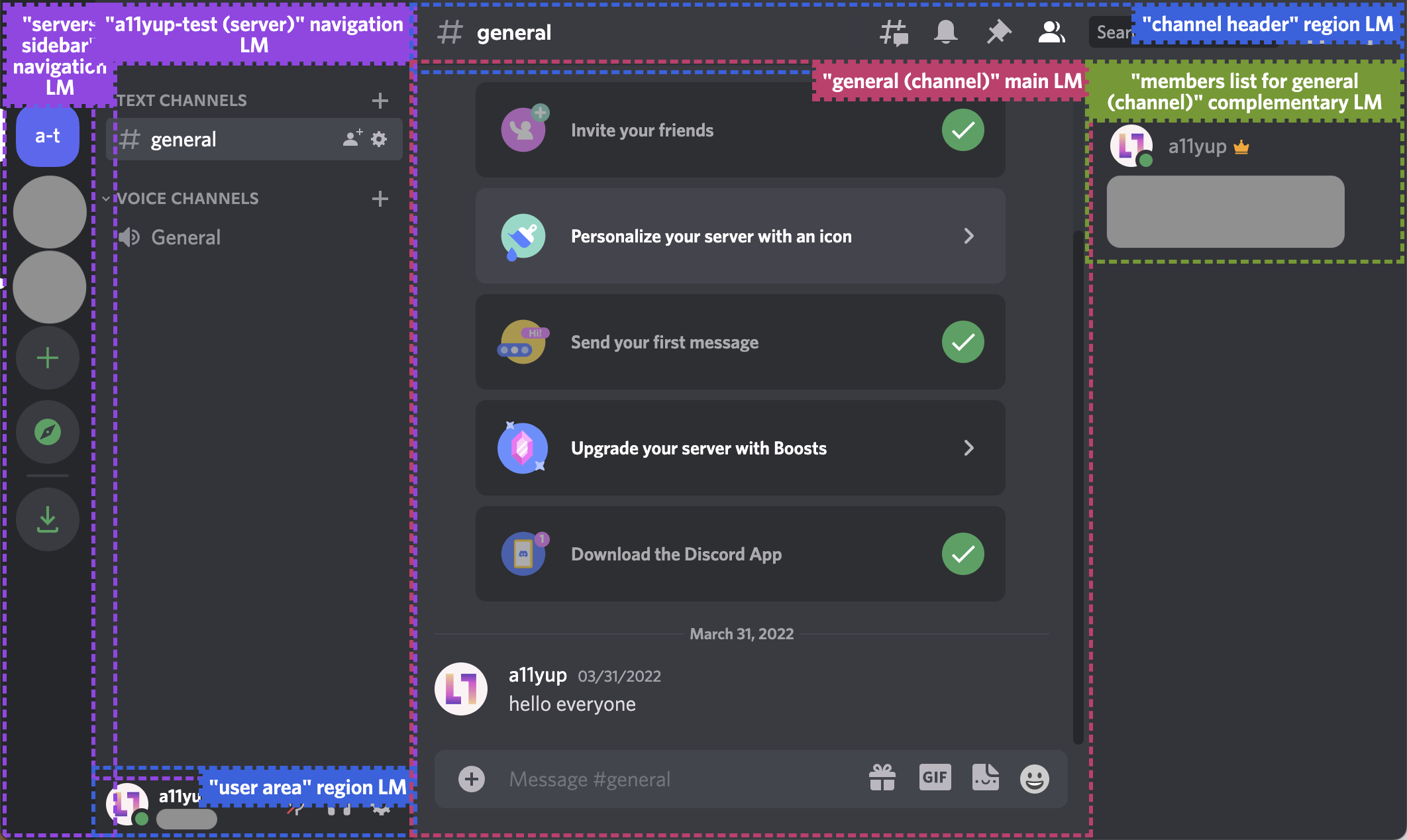
You can tell by how the layout is semantically marked up with specific landmark regions, which are also appropriately named, that the developers really take care of these things.
The different landmarks of Discord’s layout consist of:
- a “servers-sidebar” navigation landmark that contains all servers
- a second navigation landmark with the name of the current server, which contains all the channels and voice channels
- a user area region landmark for user info and quick action buttons
- a “channel header” region landmark for current channel info and quick action buttons
- the main landmark with the name of the currently selected channel
- a complementary landmark containing the member list for the currently selected channel
There are a ton of icon buttons in the UI, and they all have accessible names. Expandable sections use the right ARIA attributes to make screen readers announce if they are in a collapsed or expanded state.
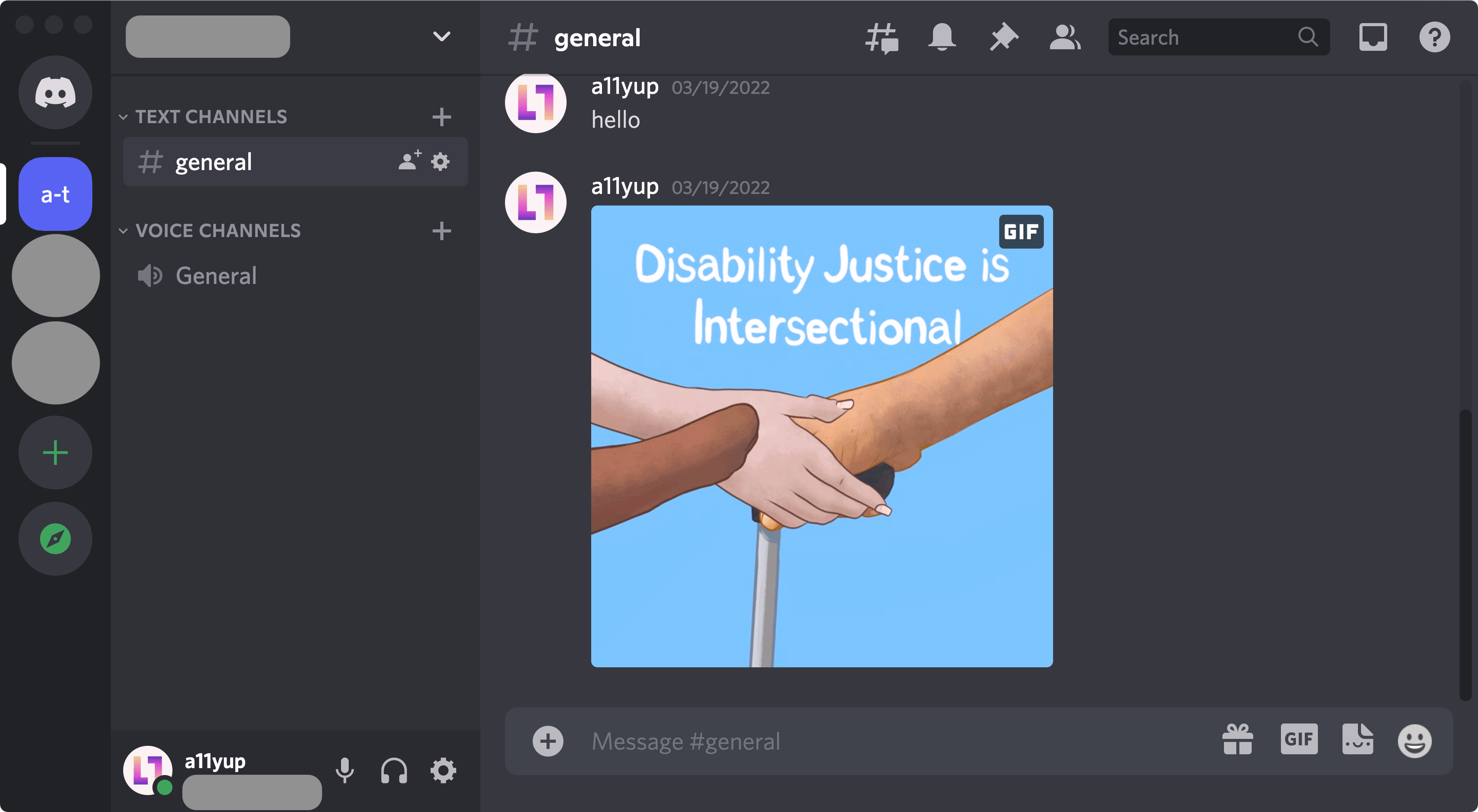
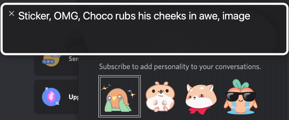
Another very delightful discovery for me was when I found out that the stickers (animated little micro cartoons) you can send into chat have alt texts associated with them. While doing this quick Discord analysis live on the A11y Up Twitch stream, I played a short game with my Twitch chat. I asked the sighted users in the chat to come up with good alt text descriptions for these mini cartoons without revealing the alt texts first. It was a fun exercise. For the viewers and also for me.
Conclusion
I am certain that I overlooked some bugs and rough edges in my quick accessibility check. But even with this short look, the outcome is pretty clear to me. There seems to be considerable work being put into making sure that Discord is as accessible as possible. All the things I found here paint the picture of a product team that makes accessibility a top priority.
That being said, for a product that is a communication service, it is unfortunately lacking one big requirement: voice-to-text for voice channels. So basically, one half of the product (if you count texting as the other half) is not accessible for deaf and hard-of-hearing folks. While today’s quality of automated voice-to-text algorithms is definitely debatable, adding such a feature would complete Discord’s accessibility goal.
Apart from that, Discord is a prime example of how an app built on Electron and React can do accessibility right. Almost.