Steam: An Accessibility Nightmare
Gaming is not only taking place inside games themselves, but also on a couple of meta levels outside. Communities around gaming are as huge as they are quite diverse (the latter of course still having a long way ahead). After taking a look at video games themselves I wanted to find out how the state of accessibility is like regarding the tools that revolve around video games. I am planning to look at things like game stores, streaming platforms and other community tools that are key in bringing gaming communities together.
Steam has been around since 2003 and started as a standalone software client for Valve’s own games but quickly became the biggest store to buy games from digitally. It also provides a lot of community features on top. But in my circles at least people mainly use Steam as a storefront to buy games.
How accessible is buying games through Steam? This was pretty easy to analyze for me because the Steam Store is completely web-based, and web accessibility is my field. You can find it on the web under steampowered.com. The same web store is embedded in the native Steam clients for each platform. So I started digging. I mainly focused on the main page of the store as the whole store is very extensive and has a lot of sub-pages. The main page alone had so many issues that I didn’t need to look further to gauge if accessibility is a priority for Steam…and boy is it a nightmare.
Let me preface my dive here: I know that huge stores like Steam that have been around for so long are “historically grown”. So changing and in the process breaking things can cause a lot of downtime and potential revenue loss. Speaking of “breaking things” though: The accessibility of Steam is broken in the first place so that a lot of players are having trouble using it and even are excluded from buying games on Steam.
Low Contrast Texts
The general color palette of Steam has always been what you would call dark mode today. Light text on dark background. Unfortunately there are a couple of instances where color contrasts are just very poor. Starting with the search field in the top right corner. The placeholder text reading “search the store” and even the text input of the user is almost invisible. Since the black font color does not contrast well at all with the dark blue background.
You might argue that this might not be a dealbreaker. You could still find the search input field as a keyboard or screen reader user, and it could be obvious that this is the search field from other cues. We will see later on why even this won’t work for everyone.

There are a lot of other instances of non-sufficient contrast like pricing and offer countdown information which, small text aside, have very poor color contrast ratios.
Inaccessible Search Field
The search field breaks a couple of accessibility rules. First, the fact that the input field does not have a label associated with it that tells a user that this is a search field. The only cues for this field being a search field is the search icon on the right which is purely visual and the placeholder text in the input field. Unfortunately placeholder texts are no valid replacement for input field labels when it comes to screen readers. They don’t treat them equally and some might even ignore the placeholder. Second, to submit the form a mute <a> tag with a click handler is used instead of a more robust submit button. The following shows the HTML code of the poor search field implementation with the lack of a dedicated label and lack of a more semantic submit button.
<div class="searchbox">
  <input
    id="store_nav_search_term"
    name="term"
    type="text"
    class="default"
    placeholder="search the store"
    size="22"
    autocomplete="off"
  />
  <a href="#" id="store_search_link" onclick="var $Form = $J(this).parents('form'); $Form.submit(); return false;">
    <img src="https://steamstore-a.akamaihd.net/public/images/blank.gif" />
  </a>
</div>
Image Links All Over the Place
This one is maybe the thing with the most negative impact on the whole store. Imagine you want to browse the store main page and want to find the offers of the day. If you are a sighted user you see all the colorful artwork and the price tags while scrolling. Tough luck if you are relying on a screen reader or are visually impaired though. Because none of that is accessible.
Most displayed game artwork is actually a link that upon clicking takes you the game page within the store. Unfortunately these links are image links: Links without a link text but instead they only have an image inside. Link texts missing means that screen reader users will not know which game this link is for. But what about the image? Maybe those have an alt attribute that describes the image? Nope. No alt attributes at all.
Going through the page with a screen reader often sounds/reads like this:

Navigation Via Keyboard
In order to be accessible a site needs to allow users to operate it with a keyboard only. There are several things that are broken regarding this. Here are the things that should work first:
- Tabbing (repeatedly pressing the tab key) through the page should move the keyboard focus indicator in a fashion that follows the visual flow of the site and does not focus things that are actually visually hidden
- Everything that is interactable should be focusable
- Everything that is interactable should be so with the keyboard alone
All of these things are in some form or other broken.
Tabbing through the page with a tab path tracking tool reveals this.
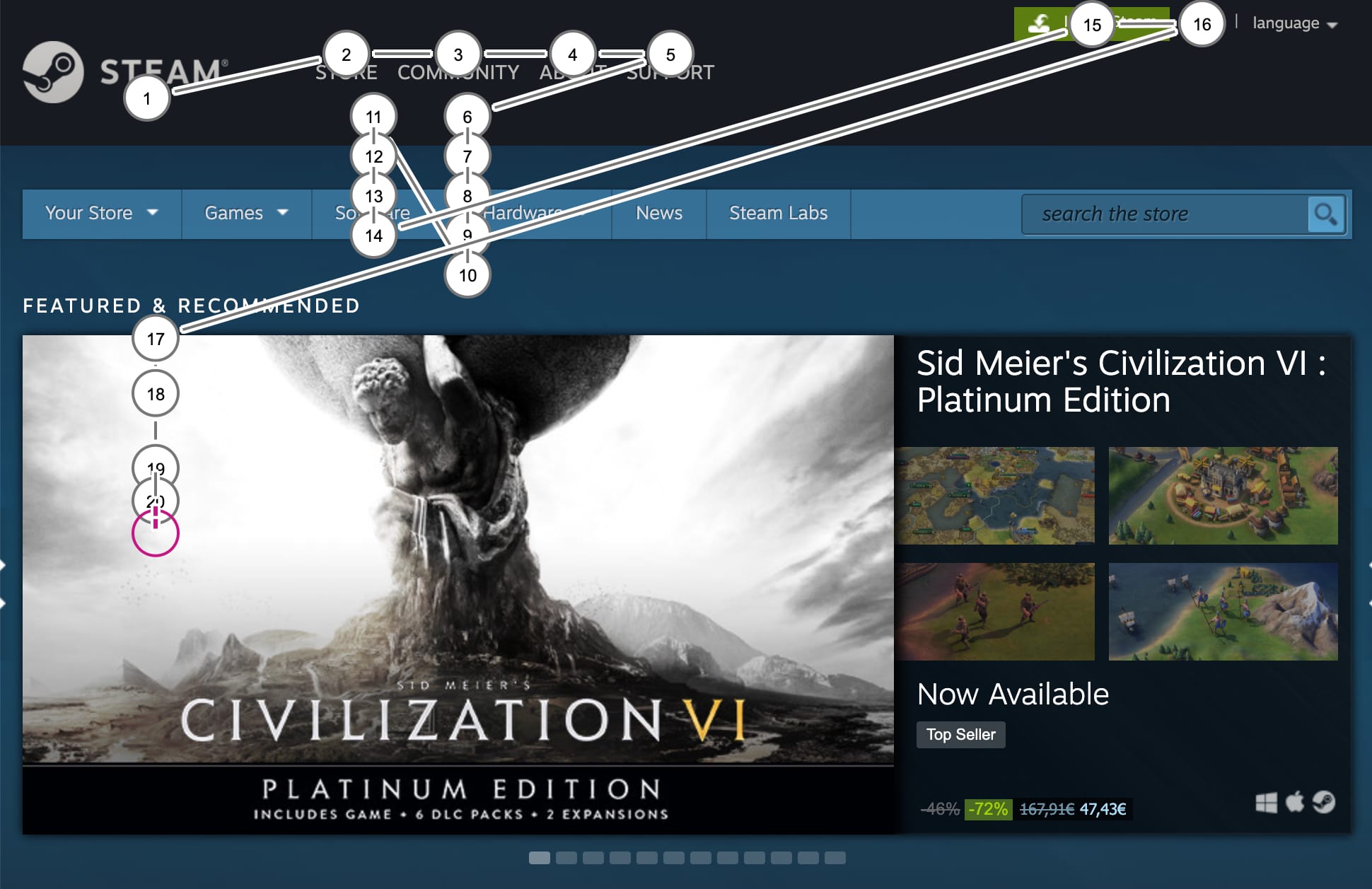
After the first few tabs through the main navigation the focus indicator visually disappears. The tab path tracking reveals that there are several visually hidden items that still receive focus when they shouldn’t.
After the 16th tab (which is the login link) a sighted user would expect the focus to move to the directly adjacent language selector. But no, it is omitted as the screenshot above shows. As a matter of fact you can tab as much as you want, there is no way to reach the language selector if you are relying on your keyboard alone.
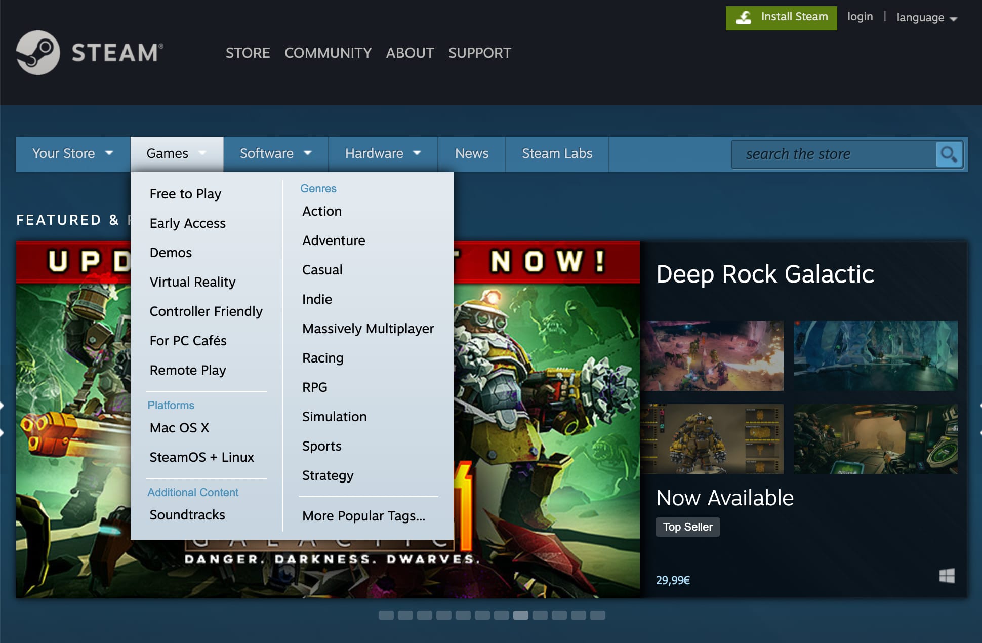
There is a second level navigation bar on the page for items like “Your Store”, “Games”, “Software” and so on. While the navigation items themselves are links that take the user to sub-pages they also provide a plethora of subsection links in a drop-down when the user hovers over the navigation item with the mouse. If you want to reach those sub links with your keyboard alone you will be disappointed. There is no way to get there.
Steam Native Apps Block Out Screen Readers
I found all of these highlighted issues on the website steampowered.com. But Steam is primarily used as a native client on Windows, macOS and Linux. And on top of all the web accessibility issues the site has the native app makes it even less accessible.
Under macOS the whole Steam app does not expose anything to screen readers. So the user will not be able to read one word of content in the Steam client.
Under Windows, it is slightly better. The store content is exposed to Windows Narrator for example, but the rest of the native Steam UI is not exposed in any way to the screen reader. I haven’t tested with NVDA, the most common screen reader on Windows. But I’m pretty sure the situation will be similar.
Steam Accessibility: What’s Up With That?
Steam is by now 17 years old, and I can understand how these oversights of basic accessibility on the web store can happen. In 2003 awareness for accessibility amongst developers was definitely not at the point at which it is today. At the same time it’s 2020 now and video games like Naughty Dog’s The Last of Us: Part 2 with big publisher backing, dedication and of course a lot of money show that they are able to achieve almost perfect accessibility for the blind. In a 3D…third person…stealth action game. Think about this. At least it makes me think about the differences in dedication to accessibility and inclusion. Because Valve for sure does not have a budget problem.