An Accessibility Check of the Epic Games Store
A while back, I took a look at the accessibility of the Steam Store from Valve. The results were pretty bad. I don’t work for Valve, so I don’t know what the priorities and internal situation is, but from an outside perspective I can only assume that the bad state of accessibility is due to a lack of priority. Additionally, Steam is almost 20 years old soon, and one can only guess how much a codebase that old might make it difficult to update it properly without big rewrites.
Epic’s Game Store on the other hand is fairly young. It is just about 3 years old as of this writing. When it comes to underlying technologies, Steam and Epic Games Store are fairly similar. Both of them are websites, built with standard web technologies. The respective downloadable store apps both use the Chromium Embedded Framework (basically an embeddable version of the core of the Chrome browser) to display the respective websites inside an app shell.
Unfortunately, something about this combination (website + CEF in an app shell) makes both store apps inaccessible to screen readers on macOS. I haven’t found out if there is any technically plausible reason for this.
So in order to test the accessibility of the Epic Games Store I relied on the website, not the app, assuming that the underlying code is the same.
Keyboard Accessibility
The keyboard accessibility on the Epic Games Store has both positive and negative aspects. Starting with the positive: Going through it with a tab stop visualizer tool shows that the keyboard focus follows the visual flow pretty naturally, without any unexpected jumps. You also don’t move focus to any invisible areas like hidden UI.
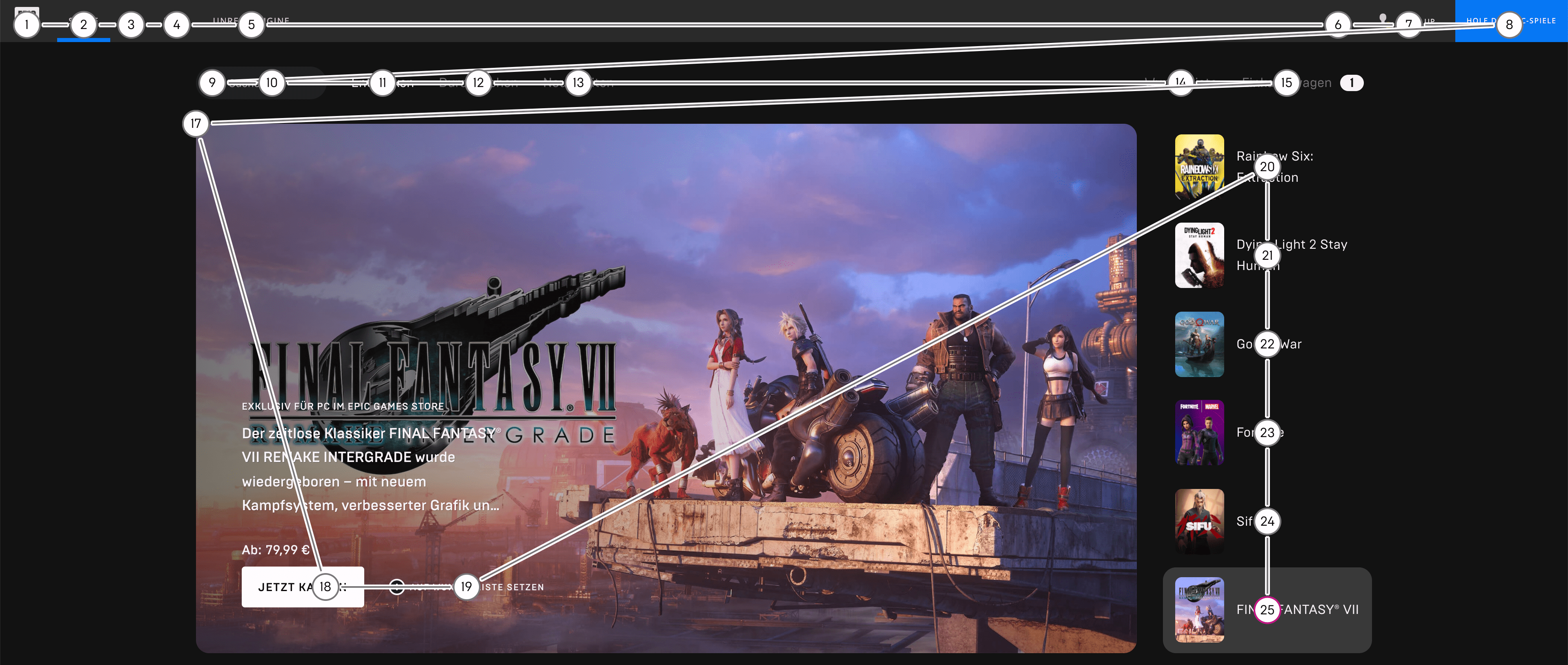
On the other hand, the keyboard focus indicator (the outline ring that shows where you are currently at with the keyboard) is not always visible or hardly visible.
In the following GIF, you can see how the “plus” button to add a game to your library shows the focus indicator (a thin white line around the button) but the game cover image itself, which is a link to the game’s page, does not show a focus indicator, although it receives keyboard focus. Pay attention to the lower left, where you can see a tab icon showing up the moment I am pressing the tab key.
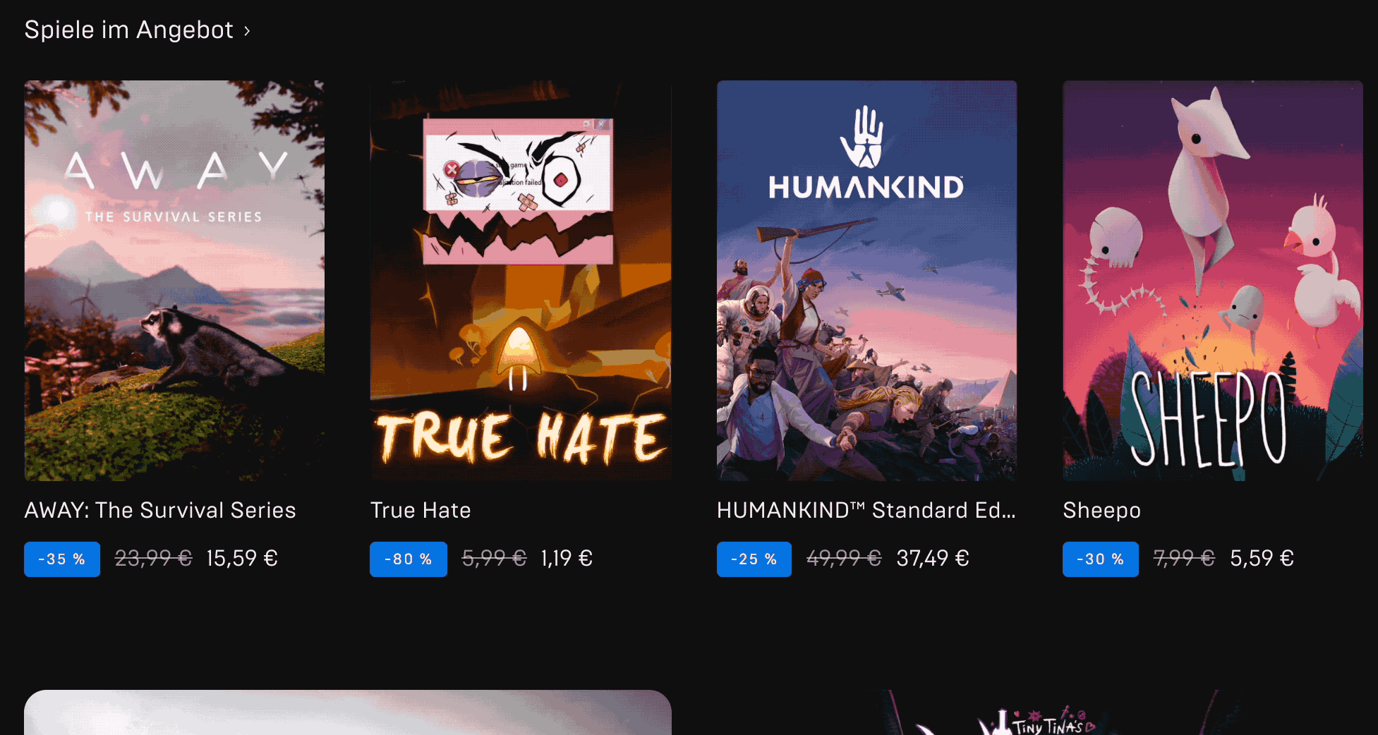
Pressing the tab key the first time puts the focus visibly on the “plus” button for the game “True Hate”. Pressing tab again moves focus to the game cover of “True Hate”, but the focus is unfortunately not visible at this point. On the next two tab presses, the same repeats for the game “Humankind”.
Color Contrasts
The color contrasts within the store site’s main page are sufficient in most cases. The general color theme of an almost-white on a dark gray is working in favor of this. There are a few exceptions here and there. While a lot of the link texts like game titles are really high contrast (14.23:1), the navigation links up top which lead to the other pages are below the minimum threshold (3.6:1).


Screen Reader Accessibility
A very quick test of screen reader accessibility also shows that core functionality of the store can be accessed and used. While there is always room for improvement when it comes to screen reader user experience, this is already way better than most websites out there. Things like expandable areas are mostly marked up correctly and announce properly via the screen reader.
Searching and trying to buy a game also works pretty smooth: The search field is very conveniently placed as one of the first elements in the layout and can be reached quickly. The search results, which expand underneath the search field, come directly next after the search field when you move the screen reader cursor to the next item. After navigating to the picked game’s store page, the “Add to Cart” or “Buy” button are easy to reach. There are rough edges though: Adding something to your cart successfully is not announced in any way. But to be fair, I haven’t seen too many good applications of this in the wild yet.
Reduced Motion
This topic is very likely a problem with most storefronts you will encounter on the web. And it’s also an issue here: In order to further engagement with the users, a lot of stores use image carousels. These UI elements usually automatically cycle through different product slides to make the users aware of different sales, for example.
One concern with this is that automatically cycling or moving parts on a page can cause difficulties for users with cognitive disabilities and/or can be nausea-inducing. Especially if the motion is initiated automatically and not by user’s choice. The image carousel in the Epic Game Store is the very first element on the top after the navigation and starts cycling as soon as the site is loaded. Unfortunately there is no way to pause or stop it which would be the bit of user choice that is missing here. The cycle animation itself on the other hand is fortunately on the more subtle side, with a short slide to the left plus a fade-in of the new item. While this is more subtle than most examples in the wild, this could be further reduced to just use a fade-in effect or at least take into account the “reduced motion” option of users to reduce the animation effect further.
The image carousel showcasing six game highlights auto-switches the slides after about five seconds. The slides transition in a combination of a small left-shift and a fade effect.
Image Alt Texts
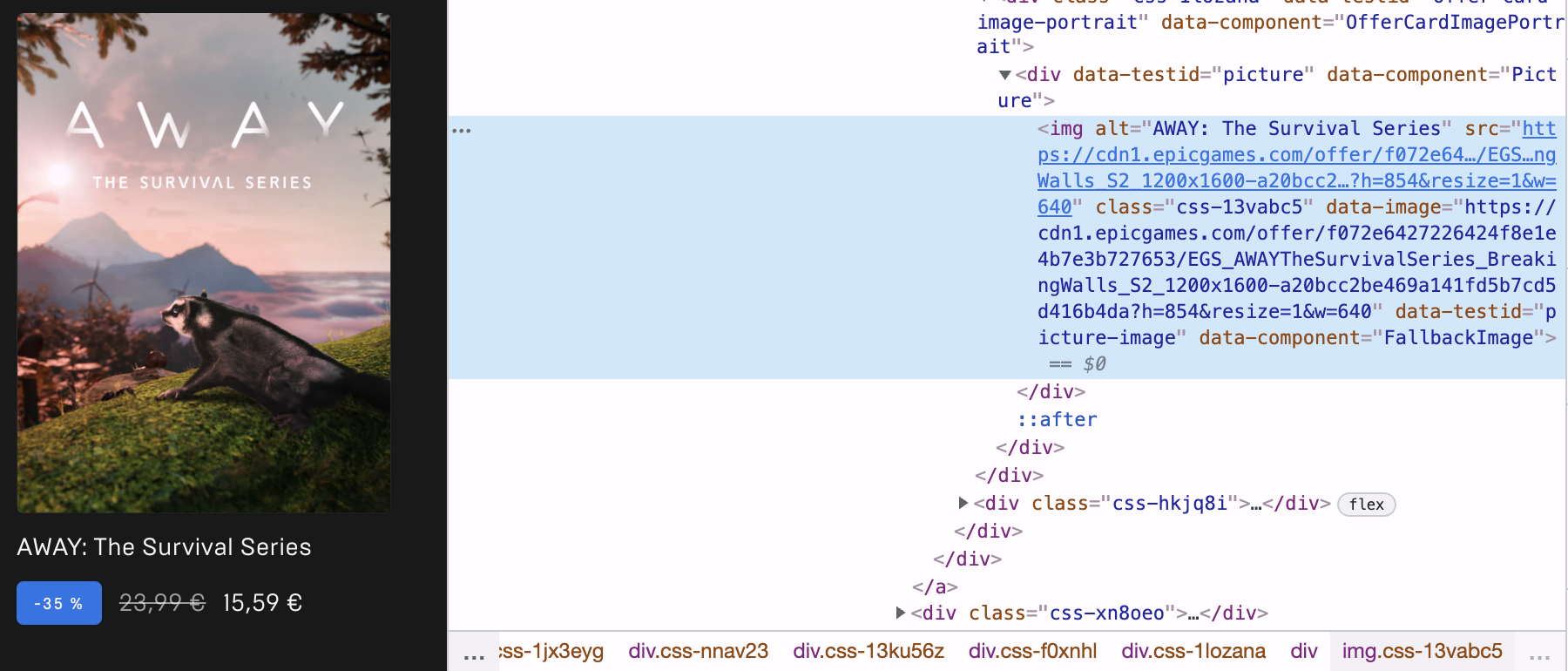
Cover images for games have alt texts in the Epic Games Store. To be honest, I was a quite surprised by this as there are already game titles directly beneath the game cover images. The titles could have already been considered a sufficient alternative and the images could have been marked as purely decorative via an explicitly empty “alt” attribute. Nevertheless, each cover image has the game’s title as its “alt” text. Compare that (again) to the Steam store, where there are often walls of cover images without any text alternatives nearby to describe which game is visible on an image tile.
Semantics
Occasionally there are problems with proper markup and semantics. Like with the “Add to Wishlist” button that can be found in the top right corner of a game cover image, but which doesn’t have button text associated with it. In which case to a screen reader it would only read as “Button” (instead of “Button, Add To Wishlist” or similar).
But for the most part things seems good from my limited testing: Heading levels seem appropriate, buttons and links are properly marked up. Even expandable areas seem to use the right ARIA attributes to make those more accessible to assistive technologies.
Conclusion
I did not expect a lot of accessibility in the Epic Games Store. Especially after seeing the disastrous results I found about the Steam store. So I was surprised to see that there is quite the indication that this store was developed with best practices for accessibility in mind. I’m sure though there is still necessary improvements to be made.
To make a fair comparison: Epic Games Store is quite a bit younger and was probably developed at a time when accessibility was already gaining more traction in mainstream web development. Also, just judging by UI complexity, the Epic Games Store is fare more simplistic than Steam and also has a way more limited feature set. It is a store and mainly that, while Steam has far more adjacent components and systems (community pages, forums, mod workshops etc.). So take my comparison between the two with a grain of salt.
It’s good to see that at least on Epic’s side things are going alright for accessibility. Except for the problem with the store app being shut off from VoiceOver on macOS. We can only wish and hope that other vendors take note and prioritize accessibility in their stores right from the beginning.